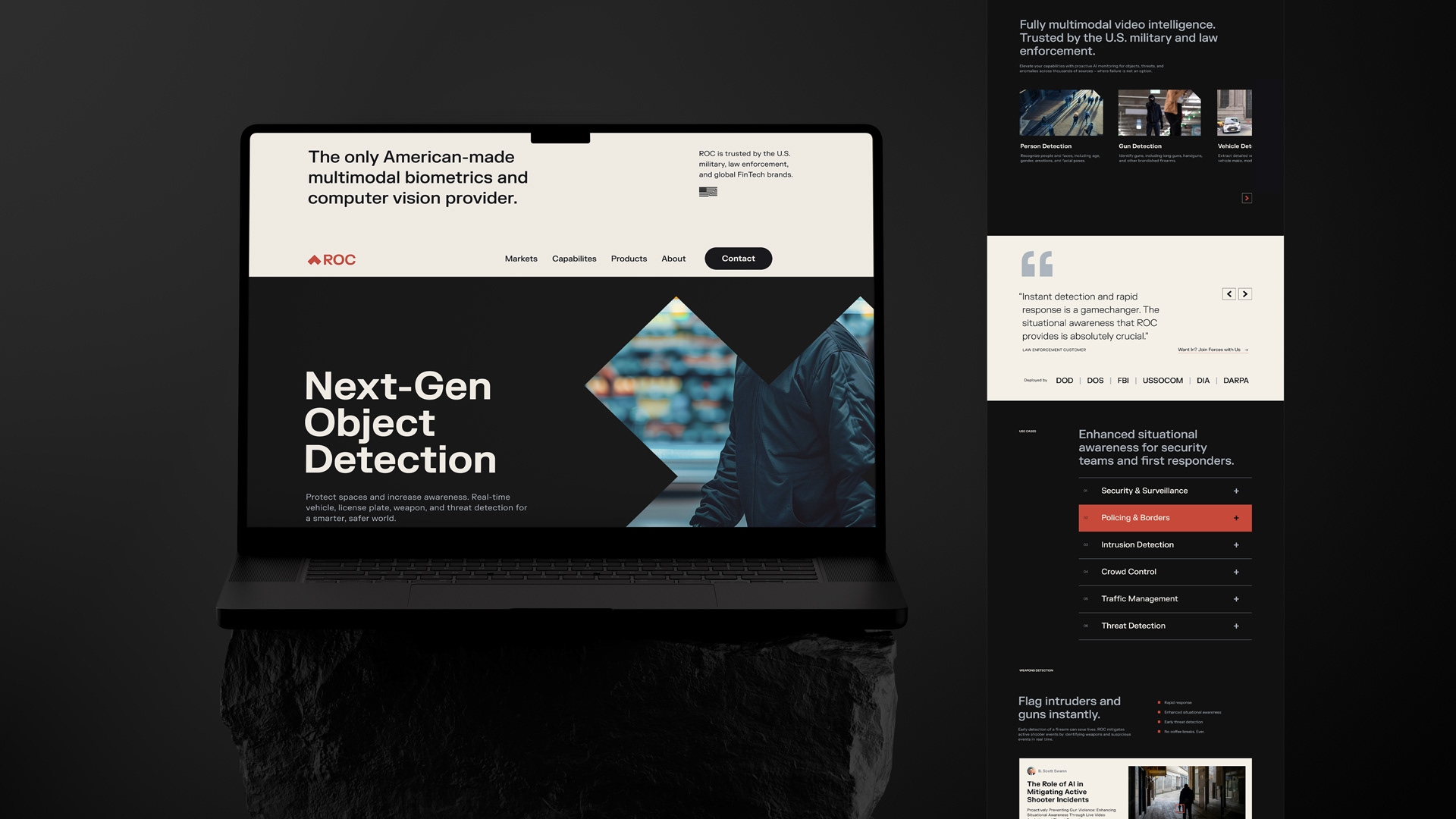
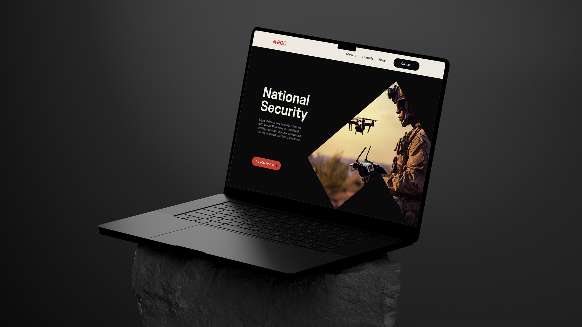
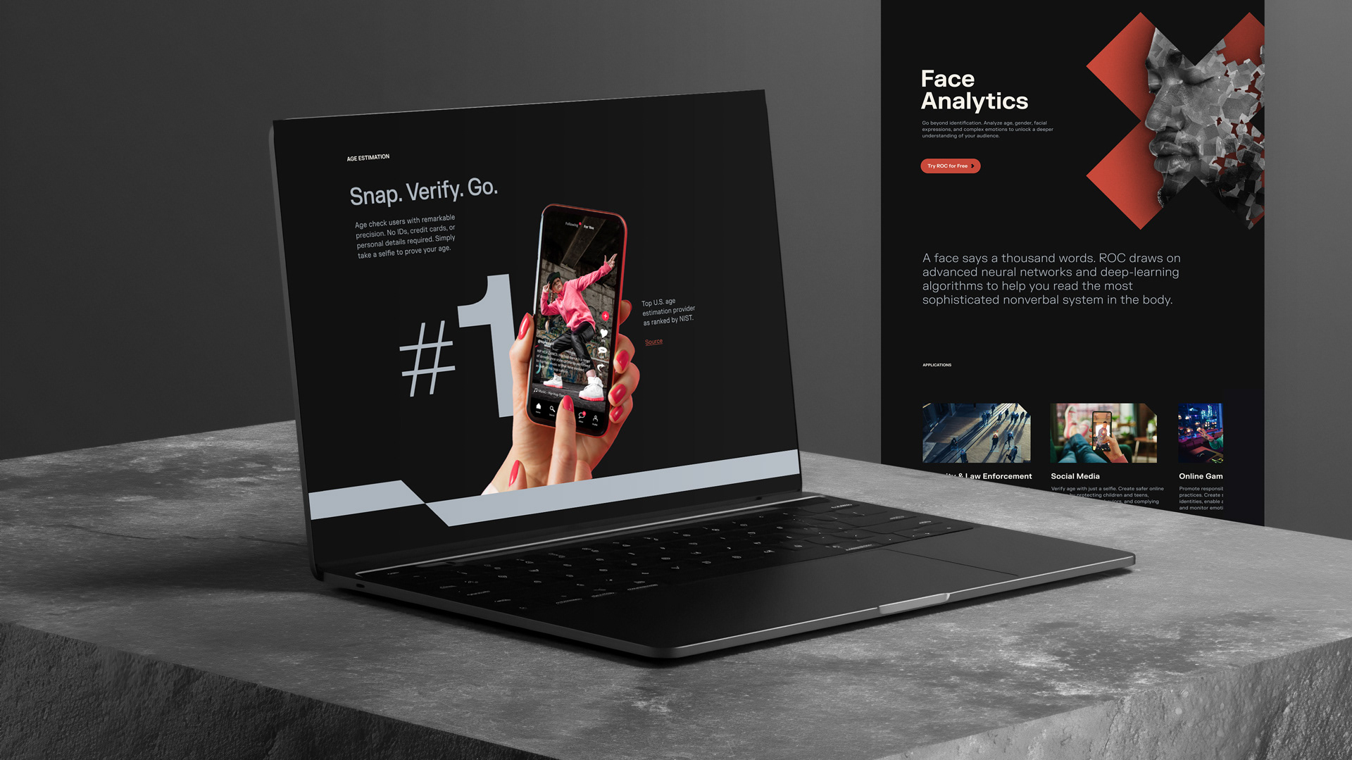
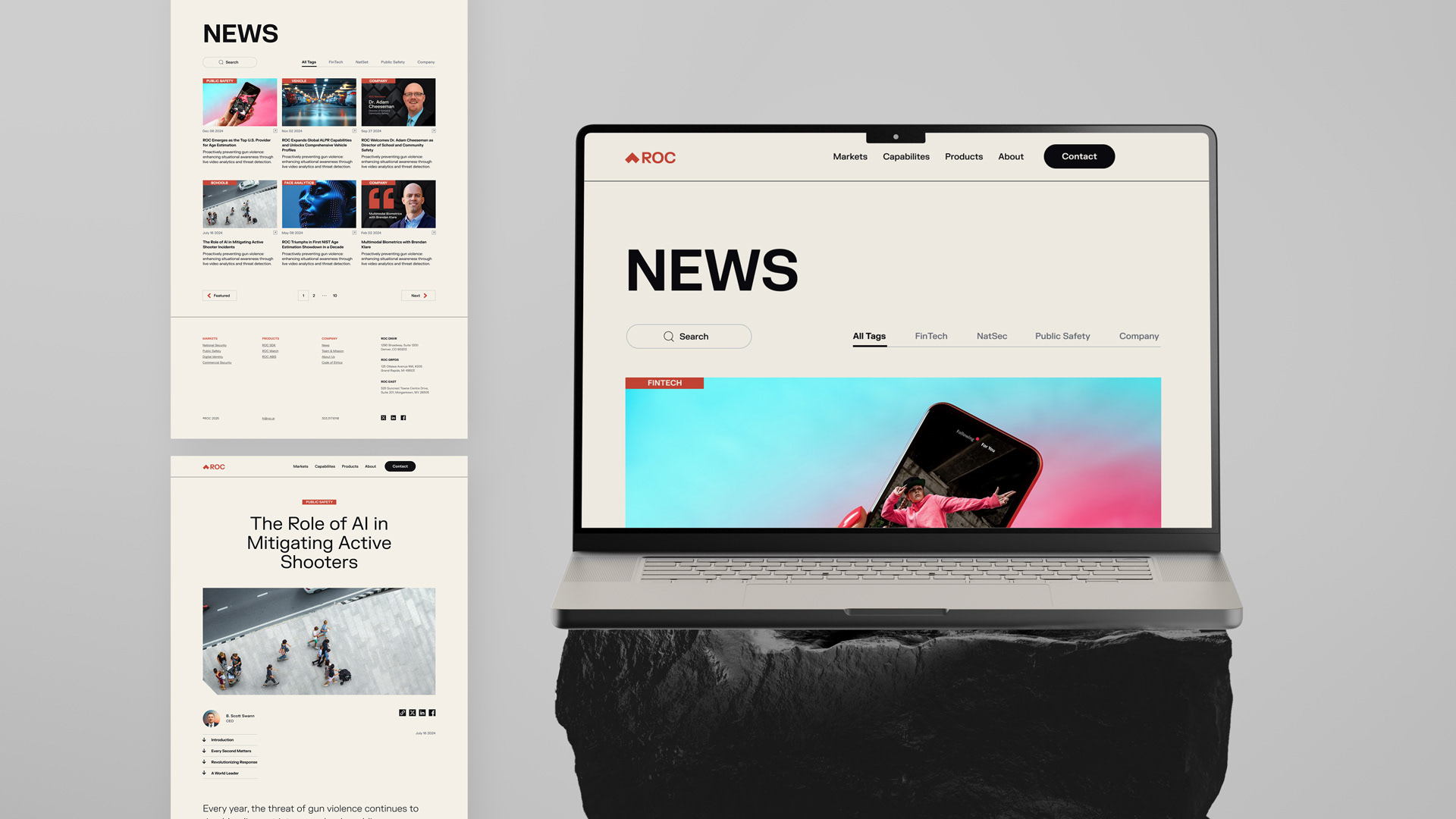


For a Vision AI company, everything starts with a single pixel—the elemental unit of perception and the core metaphor behind ROC’s reimagined brand. This concept is the foundation of our visual system, inspiring everything from logo to site design and color palette. By exploring the relationship of perception versus recognition, and the contrast between on and off, the new digital aesthetic is expressed through a predominantly dark mode interface, offset by text-rich light mode elements including navigation, the footer, featured sections, and blog content. Strategically, the website redesign includes a new sitemap and navigation to reflect ROC’s future-focused market positioning, distinct sections for fully recalibrated verticals, capabilities, and products, with updated content and designs for every page.